
The Role of Typography in Graphic Design Freelancing
Typography is often regarded as the art and technique of arranging type to make written language legible, readable, and visually appealing. However, in the world of graphic design freelancing, typography is more than just arranging letters; it's a powerful tool that can influence the overall impact and effectiveness of a design. In this comprehensive guide, we'll explore the significant role typography plays in graphic design freelancing and how you can leverage it to enhance your projects.
Typography: The Silent Communicator
Typography is often referred to as the silent communicator because it conveys messages, emotions, and aesthetics through the design of letters and characters. Here's why it's so essential in graphic design:
Visual Hierarchy: Typography helps establish a visual hierarchy within a design, guiding the viewer's eye and emphasizing key elements. This hierarchy aids in communicating the most critical information effectively.
Brand Identity: Typography is a crucial component of brand identity. It helps distinguish one brand from another, making it instantly recognizable. Think of the distinctive Coca-Cola script or the boldness of the Disney logo.
Emotional Impact: Different typefaces evoke different emotions. Serif fonts, like Times New Roman, may convey a sense of tradition and reliability, while sans-serif fonts, like Helvetica, often appear modern and clean.
Readability: Above all, typography ensures that the text is readable. If your audience can't easily read the content, your message will be lost.
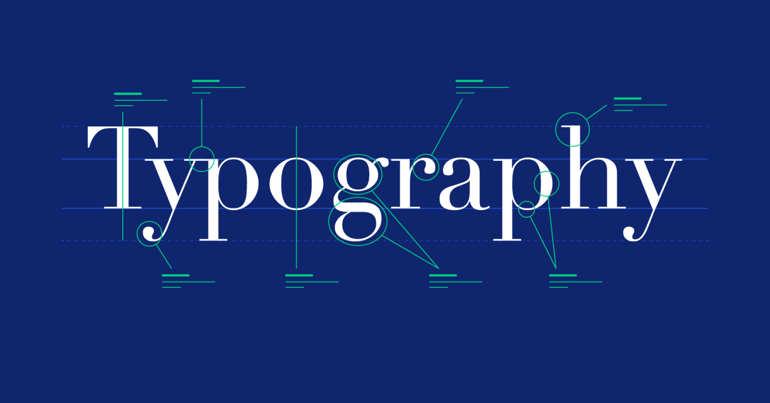
The Key Elements of Typography
Before diving into how to leverage typography effectively in your freelance graphic design projects, let's explore the fundamental elements of typography:
Typeface: A typeface is a family of fonts with similar design characteristics. Common examples include Arial, Helvetica, and Times New Roman.
Font: A font is a specific style or variant within a typeface family. For example, Arial Regular and Arial Bold are fonts within the Arial typeface family.
Hierarchy: Hierarchy refers to the arrangement of text elements to convey importance. You can establish hierarchy through font size, weight (boldness), color, and placement.
Line Length: The length of lines or columns of text affects readability. Too long, and it becomes challenging to read; too short, and it feels disjointed. Finding the right balance is crucial.
Spacing: Letter spacing (tracking), line spacing (leading), and word spacing (kerning) all influence how text appears and reads. Appropriate spacing improves readability and aesthetics.
Alignment: Text can be aligned left, right, centered, or justified (aligned both left and right). Each alignment choice affects the visual impact of the design.
Contrast: Contrast in typography involves varying elements like font size, weight, and color to create visual interest and emphasize specific text.
Leveraging Typography in Freelance Graphic Design
Now that you have a solid understanding of typography's key elements, let's explore how to effectively leverage typography in your freelance graphic design projects:
Understand the Brand and Audience
Before selecting typefaces and styles, it's essential to understand your client's brand identity and the target audience. Different fonts convey different messages, so aligning the typography with the brand's personality and the audience's expectations is crucial.
Serif vs. Sans-Serif: Consider whether a more traditional serif font or a modern sans-serif font better suits the brand's image.
Font Personality: Fonts have personalities. Some are playful, while others are formal or serious. Ensure the chosen font aligns with the brand's tone and values.
Create a Visual Hierarchy
Establishing a clear visual hierarchy is key to guiding the viewer's attention. Use typography to differentiate between headings, subheadings, body text, and captions. Here's how:
Font Size: Make headings larger and more prominent than body text.
Font Weight: Use bold or italicized text for emphasis. For example, a bold font can be effective for call-to-action buttons.
Color: Experiment with color to highlight specific text elements, but maintain readability.
Choose Typefaces Wisely
Selecting the right typefaces can significantly impact the overall design. Here are some tips:
Pairing Fonts: Combine fonts to create visual contrast and interest. For example, pair a serif headline font with a clean sans-serif body text font.
Limit Fonts: Avoid using too many fonts in a single design. Stick to two or three typefaces for a clean and cohesive look.
Pay Attention to Line Length and Spacing
Proper line length and spacing are crucial for readability. Avoid long lines of text, as they can be overwhelming. Opt for legible fonts and appropriate line spacing (leading) to enhance readability.
Experiment with Typography Styles
Typography can convey various moods and aesthetics. Experiment with different styles to see what works best for your project:
Vintage Typography: Use vintage or retro fonts for a nostalgic or classic look.
Modern Typography: Choose sleek, minimalistic fonts for a contemporary and clean design.
Handwritten Typography: Handwritten fonts can add a personal and creative touch to your designs.
Use Typography to Create Visual Interest
Typography can be a powerful tool for creating visual interest in your designs:
Typography as Art: Experiment with typography as an art form. Use text to create shapes, patterns, or illustrations.
Textures and Backgrounds: Overlay text on textures or backgrounds to add depth and dimension to your designs.
Maintain Consistency
Consistency in typography across various design elements is vital for a cohesive look. Ensure that fonts, sizes, and spacing are consistent throughout your project.
Test for Readability
Always test your typography for readability. Ask for feedback from others and consider factors like font size, color contrast, and line spacing.
Typography is an art form that goes beyond just selecting fonts. It's a crucial aspect of graphic design that can convey messages, evoke emotions, and enhance the overall aesthetics of your work. As a freelance graphic designer, mastering the art of typography will enable you to create compelling and visually striking designs that resonate with your clients and their audiences. So, next time you embark on a design project, remember the silent communicator—typography—and harness its power to elevate your work to new heights.