
Freelance Web Design Designing for Different Screen Sizes
In the realm of web design, one must master the art of adapting to the ever-changing landscape of technology. With a multitude of devices in use today, from smartphones to large desktop monitors, it's imperative for web designers to ensure that their creations look and function flawlessly on screens of all sizes. In this article, we'll explore the fascinating world of freelance web design, focusing on the nuances of designing for different screen dimensions.
Understanding the Significance of Responsive Design
Responsive design is the cornerstone of modern web development. It's the practice of creating websites that automatically adjust to fit various screen sizes and orientations. The importance of responsive design cannot be overstated, as it directly impacts user experience and search engine rankings.
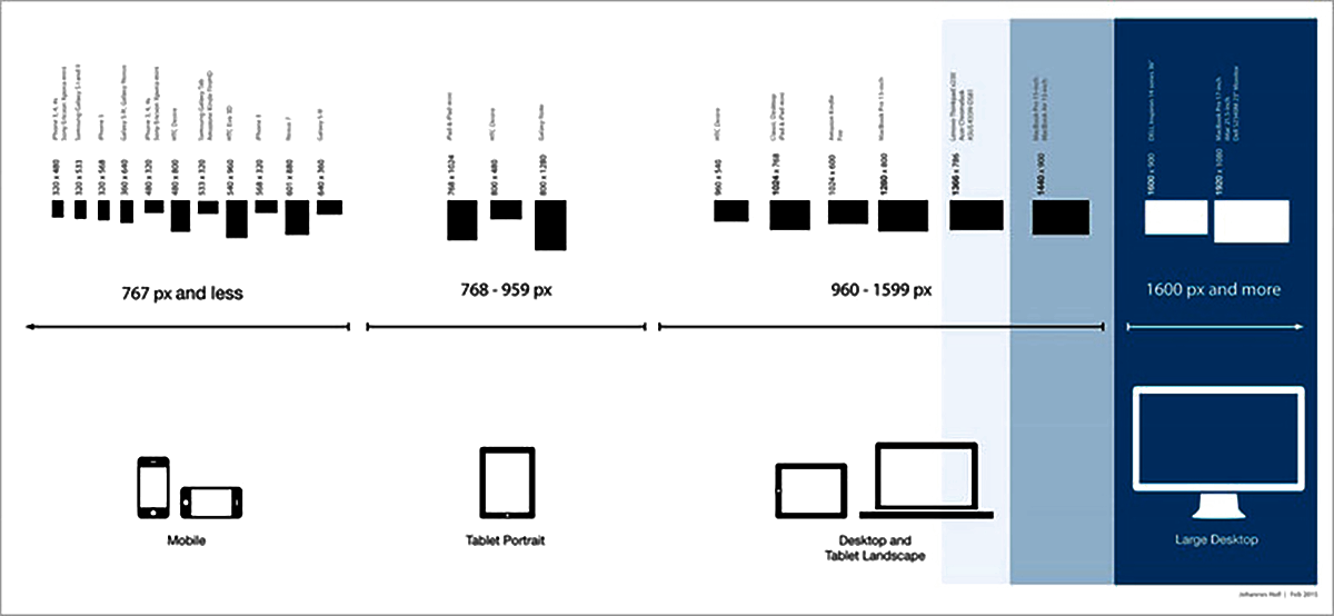
The Evolution of Screen Sizes
Screen sizes have evolved significantly over the years. Gone are the days when websites were primarily designed for standard desktop monitors. Today, we must consider a plethora of devices, including tablets, smartphones, laptops, and even smart TVs. Each of these devices comes with its own set of screen dimensions and resolutions.
Embracing Flexibility in Design
To create web designs that are truly versatile, designers must embrace flexibility. This means using fluid grids, flexible images, and media queries to ensure that the layout and content adapt seamlessly to different screens. Flexibility is the key to providing an exceptional user experience across the board.
The Role of CSS Frameworks
CSS (Cascading Style Sheets) frameworks are invaluable tools for freelance web designers. They offer pre-written code and styles that can be easily customized to create responsive layouts. Popular frameworks like Bootstrap and Foundation are widely used in the industry to streamline the design process.
Tips for Designing for Mobile Devices
Designing for mobile devices requires careful consideration. Here are some essential tips for creating mobile-friendly web designs:
- Prioritize content hierarchy: Ensure that the most important content is prominently displayed on mobile screens.
- Use touch-friendly elements: Buttons and links should be easily tappable on touchscreen devices.
- Optimize images: Compress and optimize images to reduce load times on mobile networks.
- Test thoroughly: Always test your designs on real mobile devices to identify and fix any issues.
Adapting to Large Screens
Designing for large screens, such as desktop monitors and smart TVs, presents its own set of challenges. Here are some strategies to make the most of larger screen real estate:
- Utilize widescreen layouts: Take advantage of the extra horizontal space to showcase more content.
- Enhance visuals: Use high-resolution images and videos to create a visually engaging experience.
- Implement multi-column designs: Divide content into columns to improve readability and organization.
Balancing Aesthetics and Functionality
In web design, aesthetics and functionality go hand in hand. While it's important to create visually appealing websites, functionality should never be compromised. The user should be able to navigate the site effortlessly, regardless of the screen size.
In the dynamic world of web design, the ability to craft websites that adapt to different screen sizes is a skill that sets freelance designers apart. By embracing responsive design principles, utilizing CSS frameworks, and considering the unique challenges of mobile and large screens, designers can create digital experiences that leave a lasting impression.
In closing, remember that the world of web design is ever-evolving. Stay updated with the latest trends and technologies to continue delivering exceptional results in freelance web design.
Summary: Explore the art of freelance web design for diverse screen sizes, from mobile to large desktop monitors. Learn the importance of responsive design, CSS frameworks, and tips for optimizing user experiences.
For More Articles you can go through these links:-
Freelance Web Developers Exploring the World of Progressive Web Apps
Freelance Web Development Should You Specialize or Generalize
How to Find High-Paying Web Development Clients as a Freelancer
Creating a Winning Proposal Freelance Web Development Contracts
Staying Productive and Avoiding Burnout as a Freelance Web Worker